Understanding how pages connect to each other is fundamental to SEO work. A well-structured site ensures that link equity flows properly, that important pages are accessible within a few clicks, and that search engines can discover and crawl content efficiently. LibreCrawl now includes an interactive visualization tab that transforms raw crawl data into an explorable graph, making it easier to see patterns, identify issues, and understand your site's architecture at a glance.
Why Visualization Matters for SEO
Tables and lists work well for detailed analysis, but they're not ideal for understanding relationships. When you're looking at hundreds or thousands of pages, it's difficult to see which sections of your site are well-connected and which are isolated. You might have a category page with no internal links pointing to it, or a cluster of blog posts that only link to each other without connecting back to your main content hub. These structural problems are hard to spot in a spreadsheet but immediately obvious in a graph.
Visual representations also make it easier to communicate findings to stakeholders. You can show a client or colleague the graph and point directly at the disconnected nodes or the pages with too many outbound links. The conversation shifts from abstract concepts like "crawl depth" to concrete visuals that anyone can understand. This clarity accelerates decision-making and helps teams prioritize structural improvements.
How the Visualization Works
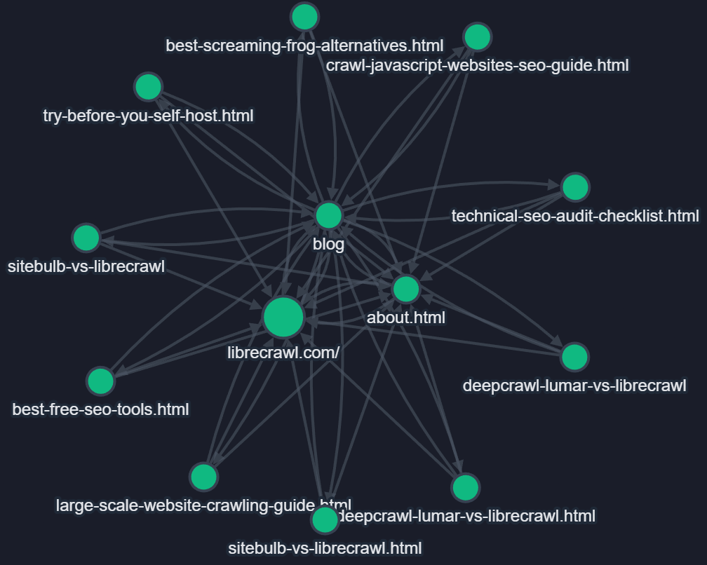
When you complete a crawl in LibreCrawl, you'll find a new "Visualization" tab next to the PageSpeed tab. Clicking it generates an interactive graph where each page becomes a node and each internal link becomes an edge connecting two nodes. The system uses color coding to indicate HTTP status codes, so you can immediately spot problematic pages. Green nodes represent successful 200 responses, blue shows redirects, orange indicates client errors like 404s, and red marks server errors. This color-coding transforms status code analysis from a tabular exercise into something you can parse visually.
The visualization is built on Cytoscape.js, a proven graph visualization library that handles large datasets efficiently. LibreCrawl limits the initial display to 500 nodes to maintain smooth performance, which covers most small to medium-sized websites entirely and provides a comprehensive overview of larger sites. If your crawl exceeds 500 pages, the system prioritizes showing the first 500 discovered pages, which typically includes your homepage, main navigation pages, and the most accessible content.
Interacting with Your Site Structure
The graph isn't just a static image. You can click on any node to highlight its connections, making it easy to trace which pages link to a specific URL and where that URL links out to. Double-clicking a node opens that page in a new browser tab, so you can quickly move from analysis to verification. Hovering over nodes displays tooltips with the page title, URL, and status code, giving you context without cluttering the visual space.
LibreCrawl offers multiple layout algorithms to help you view your site from different perspectives. The force-directed layout spreads nodes naturally based on their connections, creating organic clusters that often correspond to your site's content sections. The hierarchical layout arranges pages in a tree structure, which works particularly well for sites with clear parent-child relationships like documentation or e-commerce category trees. The concentric layout places highly connected pages at the center, making it easy to identify your site's hub pages. You can switch between these layouts instantly to find the view that makes the most sense for your analysis.
Filtering options let you focus on specific subsets of your site. You can display only HTML pages to remove noise from CSS and JavaScript files, or filter by status code to examine just the pages returning errors. This filtering happens instantly without re-querying the server, so you can experiment with different views to find the insights you need.
Identifying Common Structural Problems
Orphaned pages become immediately obvious in graph visualization. They appear as isolated nodes with no incoming edges, sitting alone far from the main cluster. These pages exist on your site but aren't linked from anywhere, meaning users and search engines can only reach them through direct URLs or sitemaps. While sitemaps help search engines discover these pages, the lack of internal links means they receive no link equity from your site's authority, and users have no natural path to find them.
Hub pages with too many outbound links also stand out visually. If you see a node with dozens or hundreds of edges radiating outward, that's a signal that the page might be trying to do too much. Link equity gets diluted across all those outbound links, and users face decision paralysis when presented with too many options. The visualization makes these overloaded hubs obvious, whereas in a table, you'd need to sort by link count and specifically look for the pattern.
Disconnected clusters reveal sections of your site that don't integrate with the rest of your content. You might have a blog that links extensively within its own posts but rarely connects back to your main product pages, or a resource center that exists as its own silo. These disconnected clusters limit how link equity flows through your site and can create confusion for users who might not realize these sections exist. The graph shows these problems as separate node groups with few or no edges connecting them to the main cluster.
Real-Time Updates During Crawls
The visualization updates in real-time as LibreCrawl discovers new pages. When you have the Visualization tab open during an active crawl, you'll see nodes appear and edges form as the crawler finds new URLs and their connections. This live feedback helps you understand how your site reveals itself to a crawler, showing which sections are discovered first and how link paths lead to deeper content.
Watching the graph build itself can reveal crawling issues that aren't apparent from the final results. If you notice that certain sections of your site appear very late in the crawl, that suggests they're buried deep in your link structure or only accessible through less prominent navigation. This real-time insight helps you understand not just your site's final structure but how that structure manifests during the discovery process that search engines also follow.
Saving and Loading Visualizations
LibreCrawl's save and load functionality now includes full support for visualizations. When you save a crawl, all the data needed to recreate the graph is preserved in the JSON file. Loading that crawl later restores not just the tables and statistics but also rebuilds the complete interactive visualization. This means you can save snapshots of your site's structure over time and compare how it evolves after making changes.
The ability to export visualizations as PNG images makes them useful for reports and presentations. You can capture the exact view that best illustrates the point you're making, whether that's showing orphaned pages, highlighting a disconnected content cluster, or demonstrating how your main navigation creates a hub-and-spoke structure. These images provide compelling visual evidence for recommended structural changes.
Performance Considerations
Graph visualizations can be computationally intensive, especially for large sites. LibreCrawl addresses this through several optimizations. The 500-node limit ensures smooth interaction even on modest hardware. The force-directed layout algorithm uses carefully tuned parameters to spread nodes efficiently without excessive computation. The system only updates the visualization when the tab is active, avoiding wasted resources on background rendering.
For sites with thousands of pages, the 500-node view provides sufficient insight to identify structural patterns. If you need to analyze a specific section in detail, you can use the filtering options to focus on that subset, which often brings the node count well below the limit and allows you to see fine-grained relationships within that section.
Getting Started with Site Structure Visualization
The visualization feature is available now in LibreCrawl's latest release. If you're running a self-hosted instance, pull the latest code from the GitHub repository to access the new Visualization tab. If you're using the online demo at librecrawl.com/app, the feature is already active and available for all users, including guest accounts.
To use the visualization, simply run a crawl as you normally would. Once the crawl completes or while it's running, click the Visualization tab. The graph will generate automatically from your crawl data. Try clicking on nodes to see their connections, experiment with different layouts to find the view that works best for your site's structure, and use the filtering options to focus on specific types of pages or issues.
Site structure visualization transforms the way you understand website architecture. What once required mentally mapping relationships from tables and lists now appears as an interactive graph that you can explore intuitively. Whether you're conducting a technical SEO audit, planning a site migration, or explaining structural issues to a client, the Visualization tab in LibreCrawl gives you a powerful new tool for making sense of how websites connect internally and where improvements are needed.